Salesforce Winter’22 Release is full of surprises! They really are putting a lot of effort on flows and bringing major changes to the platform.
In this article, I’ll show you my favourite features of this release (especially the ones that support the 80% clicks 20% code culture that Salesforce is well-known for), along with others that I found to be quite cool as well. Sounds good? Just start reading!
Here’s the table of contents for this article:
1. Favourite Flow Features
1. Call a Subflow from a Record-Triggered Flow
With the Summer’20 release, Salesforce brought to us a marvellous feature – record-triggered flows. Since then, a lot of developers (myself included) have been reluctant about using this feature, because we could not use the “subflow” action to call other flows inside a record-triggered flow. This made it impossible to reuse logic done with other flows and in some cases also impossible to maintain a guaranteed order of execution within record-triggered flows for the same object.
“If an object has multiple active record-triggered flows that are configured to run before the record is saved, we can’t guarantee the order in which those flows are executed.”
That’s going to change with Winter’22 Release! Record-Triggered Flows now can call Subflows.
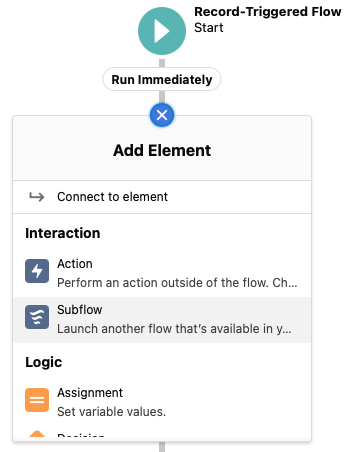
Since Salesforce is planning to retire Process Builders soon, that’s great news. Also, developers can start to prepare and migrate logic and develop new automations using Record-Triggered Flows maintaining best practices. Really cool feature.
2. Debugging Enhancements for Record-Triggered Flow
One cool feature of Record-Triggered Flows is the ability to configure multiple paths. For example, on flows that run after the record is saved you can have an immediate actions path and a scheduled actions path.
With the Winter’22 Release, when debugging a Record-Triggered Flow with more than one path, the first thing you’ll be asked to do is select which path you’d like to debug.
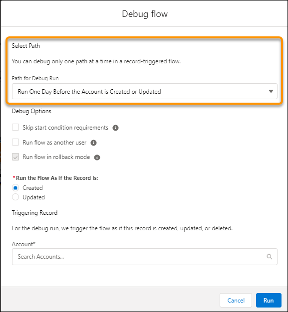
Debugging is a very important step in the development process, so I consider this feature worth mentioning.
3. Screen Flow: New Roll Back Records Element
Data elements on flows were limited to Create, Read, Update, and Delete (typical CRUD). Salesforce now introduced a new action called “Roll Back Records“, which allows cancelling pending record changes on Screen Flows.
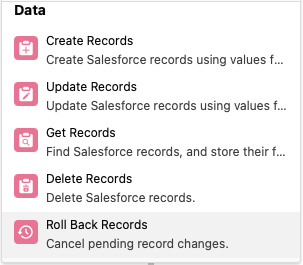
This feature really puts screen flows in a stronger position, since it allows developers to have deeper control in database transactions, which was only possible with Apex code until now.
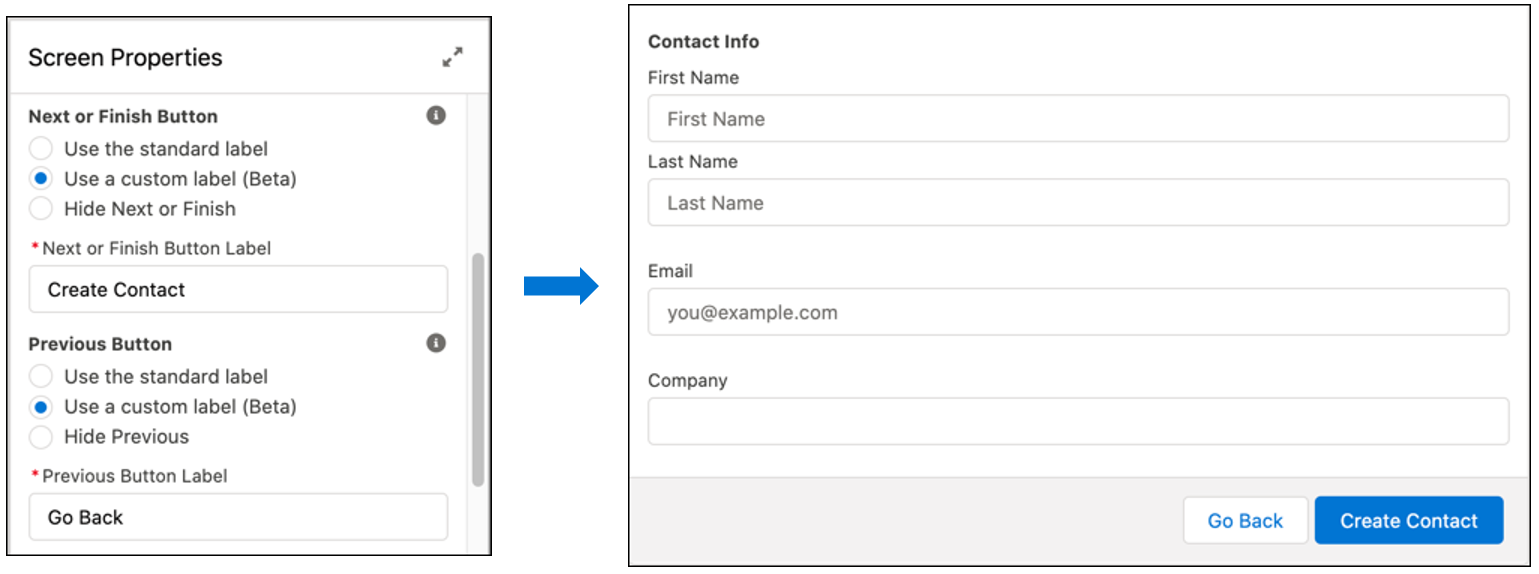
4. Relabel the Navigation Buttons in a Screen Flow
There are times when Pause, Previous, and Next just aren’t quite exciting enough to define your navigation within your Flow. I had users complaining that “Finish” or “Cancel” isn’t clear enough, they rather prefer “Yes” or “No”, or anything else.
With the Winter ’22 Release, the “Previous”, “Pause”, “Next”, and “Finish” button label texts can now be customized. Using the customized screen navigation options, you can let a user know what to expect when the user clicks the button. Previously, to customize the footer labels, we needed to build custom Lightning Components.
2. “Your Account” App
Salesforce has given the billing section of your org a revamp. This is where you can see your Salesforce invoices, products, and contracts. No need to head over to Salesforce Checkout.
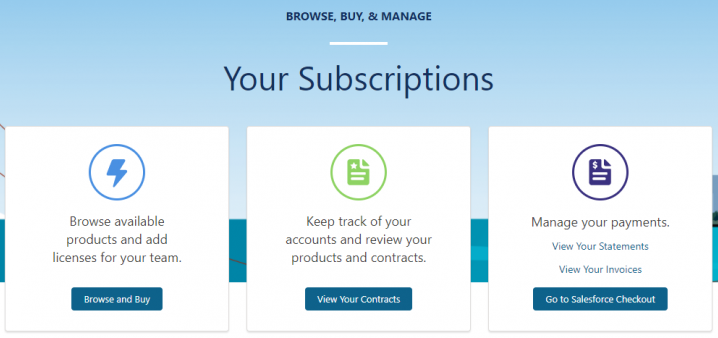
Also, speaking of “Salesforce Checkout” on Classic, this will now be renamed to “Manage Subscriptions”.
3. Dynamic Interactions
With Dynamic Interactions in the Winter’22 Release, an event occurring in one component on a Lightning page, such as the user clicking an item in a list view, can update other components on the page. Also, now you can create applications with components that communicate and transform based on user interactions, all in the Lightning App Builder UI.
Dynamic interactions are useful when you need to have multiple components mixed in one record page, and you need to fire events to each other and make them interact based on user actions.
4. Favourite Mobile Features in the Winter’22 Release
1. New Home Page for Salesforce Mobile Users
A new navigation item will be available with Winter ’22 Release: Mobile Home is a landing page that end users can personalize with the content they care about most. Also as an admin, you can add Mobile Home to any phone-activated Lightning app, or to the Mobile Only navigation, the same way you customize any other navigation tab. After it’s added, the Mobile Home tab appears only on users’ mobile devices and doesn’t show up on desktop. Also, remember to set it as the first tab in your Lightning App and your mobile users have a brand new landing screen every time they open the app.
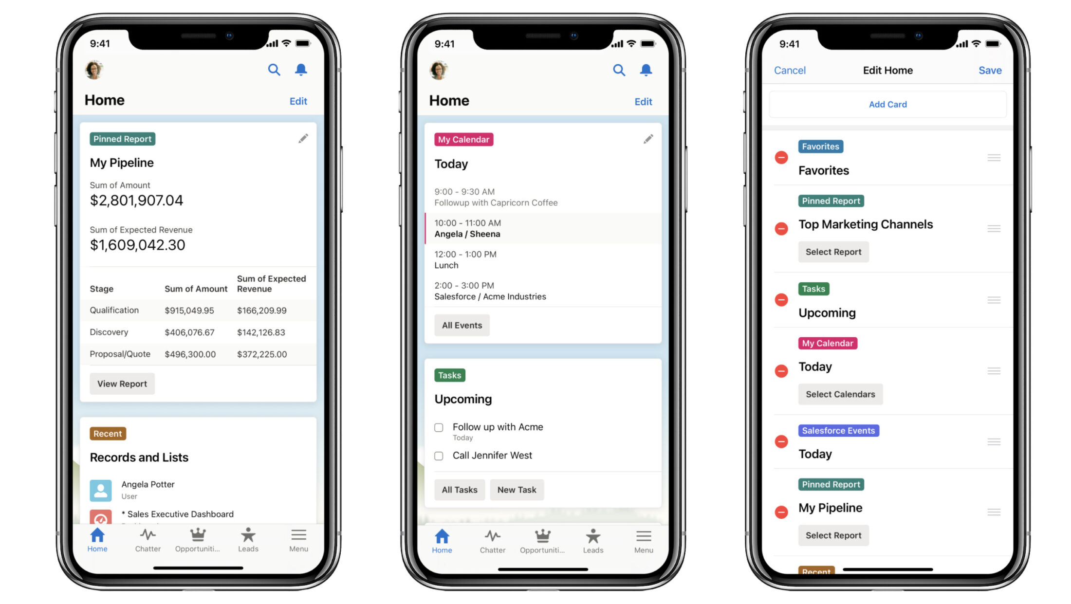
This feature replicates what users like the most on the Salesforce desktop version, delivering upcoming tasks and reports into a landing screen, putting what’s the most important information into a single user-friendly page.
2. Full-width Salesforce app for iPad OS and Android tablets
The new full-width tablet app experience is now available in the Salesforce mobile app on iPad and Android tablets as an administrator opt-in beta feature. As a result, this experience uses the tablet’s full screen to display desktop record layouts with mobile optimized components.
Above all, it supports Lightning apps, full-width Lightning record pages, Lightning navigation, and Einstein Analytics.
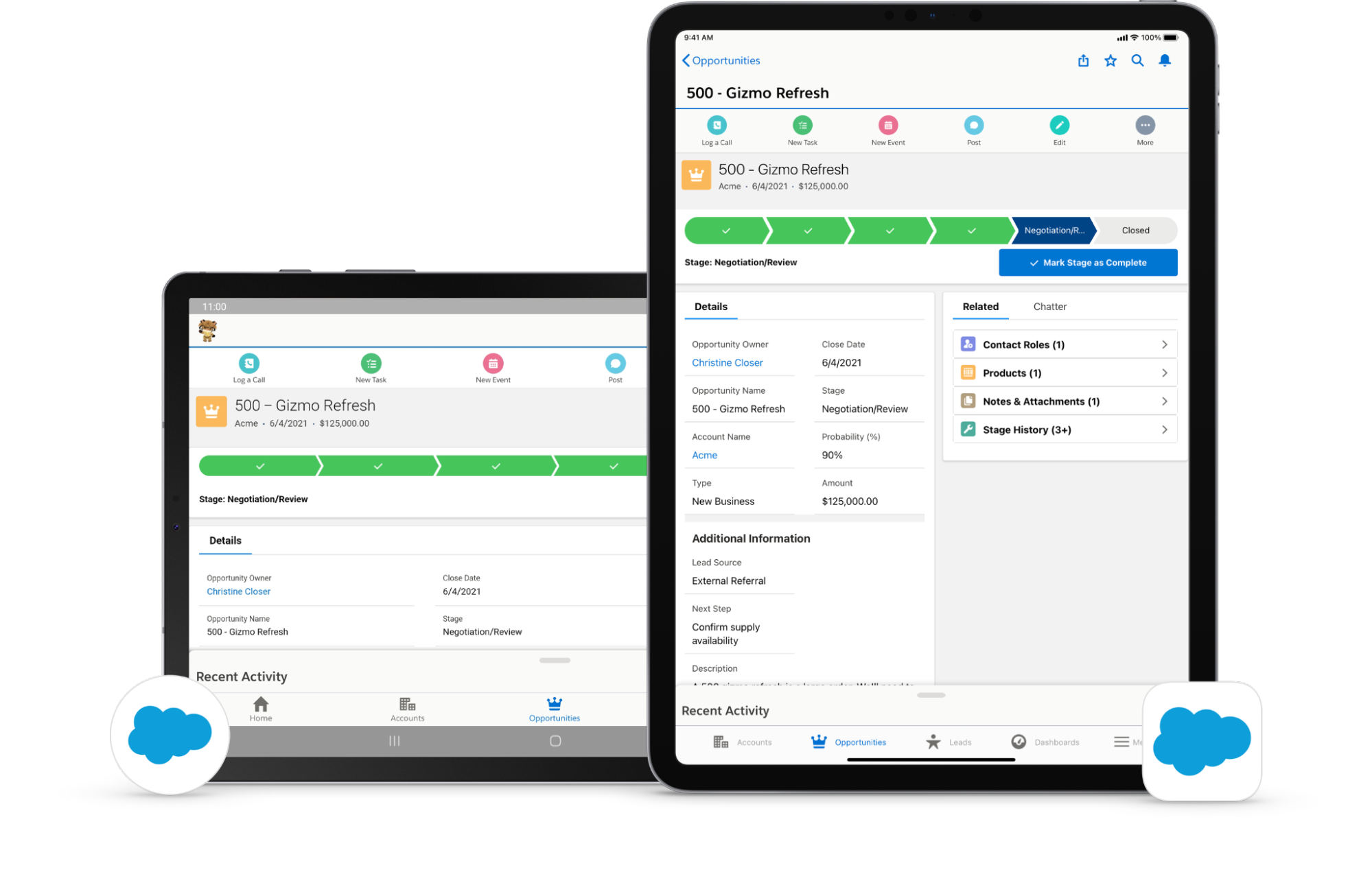
The Salesforce app is an interesting update in the Winter’22 Release. Therefore, it allows users to stay mobile in the field and trust more using tablets for their work. For instance, it’s better than using the web browser on tablets, which was the workaround available for tablet users and it works but lacks all the good features in the Salesforce mobile app.
I hope you have enjoyed reading this post about the Winter’22 Release! Subscribe to Stellaxius Knowledge Center to keep up with CRM and Salesforce latest news!
SUBSCRIBE KNOWLEDGE CENTER
Subscribe for free to our Knowledge Center to get the latest articles straight to your inbox!


